


 FREE AI performance audit


Written By
Author's Picks
- How Outdated Ecommerce Technology Is Killing Online Stores in 2025
- 30/04/2025
- How To Connect Domain To Wix: A Step-by-Step Guide For Setup
- 20/12/2024
- Top Wix eCommerce Features for your Online Store
- 18/12/2024
Categories
- AI for Startups
- AI in Web Development
- AI Integration
- AI Platforms
- AI Prompt
- AI Tools
- AI Trading Software
- Android App
- Android vs iOS Development
- Angular
- API
- API Development
- App
- app development
- App Idea
- App User Feedback
- Application
- Artificial Intelligence
- Audit Services
- Automotive Industry
- Awards and Recognition
- Business Consulting
- Business Website
- Chatbots
- CRM
- CRM for Financial Advisors
- Custom CRM
- Custom SaaS
- Custom Website
- Customer Service
- dashboard design
- Developing a Mobile App
- Digital Business
- E-commerce
- EMR Integration
- Finance
- Financial Advisors
- Financial Advisors
- GIT
- Health Insurance
- iOS App
- iOS App Development
- IoT Mobile App Development
- IoT Platforms
- IT Audit Services
- IT Consulting
- IT Strategies
- Java Development
- Laravel
- Lean Canvas
- Learning Management System
- Logistics Apps
- Mobile App Development
- MVP
- Native App
- News Aggregator Site
- OTT
- Outsourcing IT
- Payment Gateway
- predictive analysis
- Product Launch Strategy
- Progressive Web App (PWA)
- Prototype
- Recommender Systems
- Ruby
- SaaS
- SaaS Application
- SaaS Business
- SaaS Company
- SaaS Development
- SaaS Product
- SaaS Project
- Sales Funnel
- SEO
- Shopping Cart
- Software Development
- SSL and TLS
- Startup Checklist
- Technology
- Tetradic Color Scheme
- UI/UX Design Company
- Unit Testing
- User Flow
- User Testing
- Web Development
- Web Performance Optimization
- website Maintenance Services
- Website Migration Service
- Website Speed Optimization
- WooCommerce
- WordPress
Imagine going to a website from your phone and the text is too small, images are distorted, and you actually have to pinch and zoom in order to read anything, arguably one of the most frustrating internet experiences someone can have! But this is what happens when a website is not mobile-friendly.
We live in an age where smartphones and tablets are used more often than computers to access the internet. A mobile-friendly website ensures that no matter how users interact with your site, they will have a good experience. It also helps with SEO rankings so your site is visible on Google. If your site is not optimised for different screen sizes, then you could be losing out on potential customers without even knowing it.
Let’s understand the importance of responsive web design and how it can help your website survive in this mobile-first era.
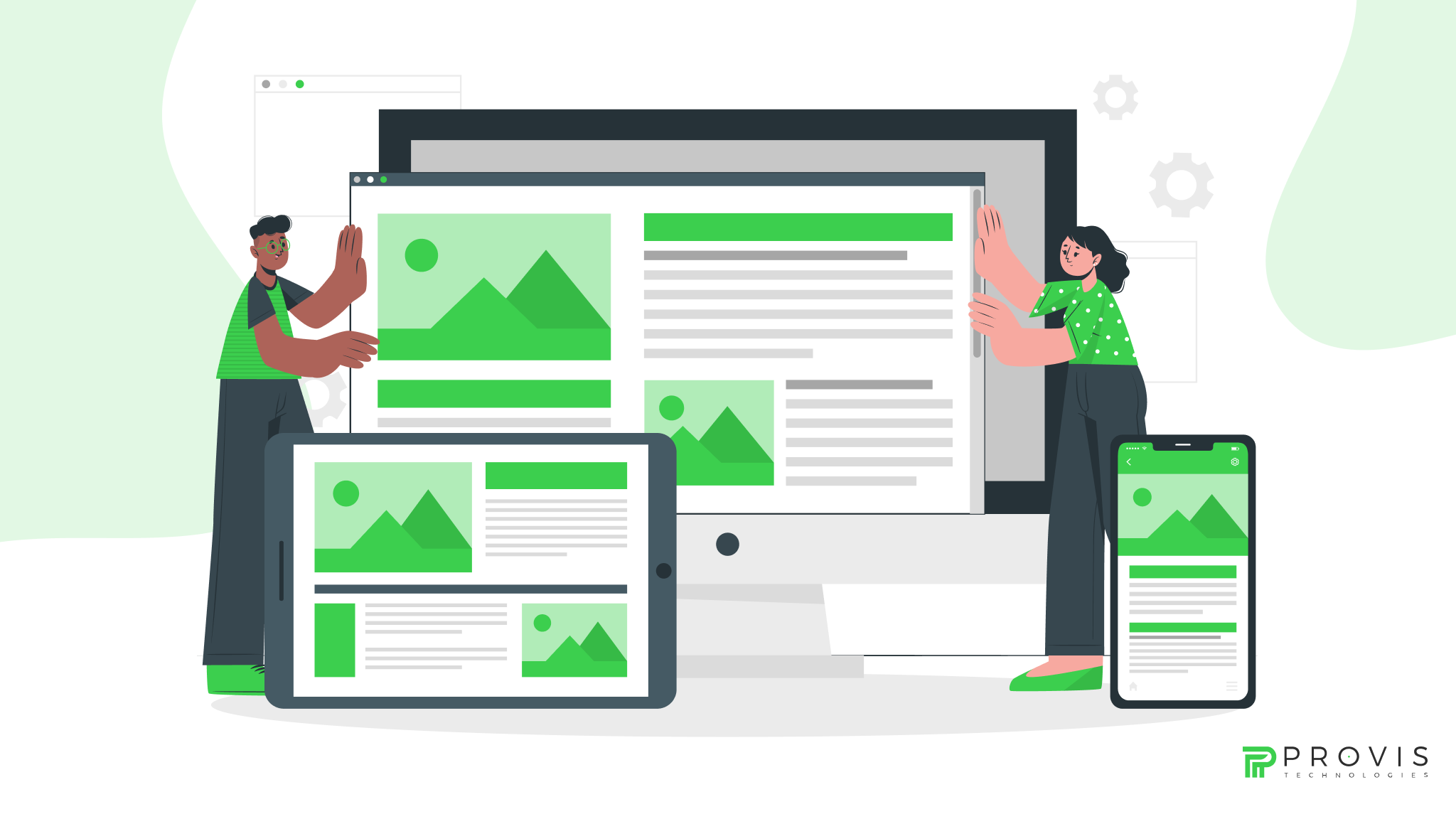
What is Responsive Web Design?
Responsive web design is an approach to building a website that makes it compatible with different screen sizes and devices. Instead of developing multiple versions for desktop, tablet and phone, a single website will mould itself to any screen.
This is achieved by using fluid grids, which automatically resize elements to accommodate a screen, rather than using fixed pixels. Flexible images ensure photos and images don’t break the layout and media queries apply different style sheets depending on whether you are viewing on a computer screen, tablet or mobile phone – in other words, it ensures your site looks great without having to pinch and zoom because of content being too large or tiny.
Let us now move forward to understand the importance of responsive web design.
The Importance of Responsive Web Design
We live in a mobile-driven world, where people browse, shop and even work from their smartphones. If your website isn’t optimised to be viewed on their phone, you’re alienating a huge chunk of potential visitors.
But, why is mobile optimisation so important?
Well, Google’s ranking system prioritizes websites that function well across all devices – and since a lack of responsiveness will cause your website rankings to drop (which I’ll explain more about in a bit), lower rankings will inevitably result in less traffic, leads and revenue.
Not to mention an unoptimised site leads to higher bounce rates — people leave fast when they can’t navigate a site. And let’s face it: First impressions are everything. If users can’t read or aren’t comfortable with the design, they’ll bounce.
Key Benefits of Responsive Design
To better understand the importance of responsive web design, let’s take a look at some of it’s key benefits. The benefits of responsive web design are not all about looks. There are some real advantages that will enhance performance, engagement and revenue (if you’re in e-commerce).
Improved User Experience
No one likes a frustrating browsing experience. With user-experience web design, visitors can easily get around your website without pinching, zooming or scrolling for days. A seamless design = better readability and interactions + actually enjoying your time on a website.
Increased Mobile Traffic
More than 60% of total internet traffic worldwide now comes from mobile devices. So, if you want to make sure you don’t miss out on over half of all potential traffic, then it makes sense to have a website that works well and looks great on mobile.
Higher SEO Performance
- Google rewards mobile-responsive websites with higher search rankings so you can get more exposure in search results.
- A single responsive site eliminates the need for multiple content sources, meaning you won’t run into duplicate content issues, having a mobile and desktop site.
Faster Page Load Speed
Website Speed is a major factor for both user-engagement, and SEO ranking.
- A responsive web design eliminates unnecessary redirects leading to minimal load time.
- A slow website can be equally detrimental to your search rankings. This is because Google considers page speed as a key ranking factor.
Cost and Time Effective
It is super easy to manage websites with responsive design, as you will have to make just one SEO campaign, which would eventually bring on more sales.
Higher Conversion Rates
A slick, mobile-optimised experience helps to build trust and keeps visitors on your site. And when people can find what they’re looking for, they’re more likely to take that action — whether it’s buying a product, signing up for a newsletter or getting in touch.
Website Design Trends & Best Practices for Responsive Design
A great website design isn’t just about applying beautiful colours and piecing together some visuals – it’s about consistently presenting your brand’s personality through an innovative and well-structured visual experience that engages with your target audience.
With the average user spending less than 15 seconds on a website, a visually stimulating, beautifully designed site is crucial to having a lasting impression on those who visit you.
Flexible Layouts
Instead of fixed pixels, use percentage-based widths. This allows elements to resize fluidly, ensuring that content looks great on any screen.
Optimise for Touchscreen Navigation
Larger buttons, touch-friendly elements, and well-spaced links improve mobile usability. Avoid any tiny buttons that are hard to tap!
Prioritise Content Hierarchy
Make sure the most important content is what users see first. Headlines, CTAs, and key information should be at the top and easy to find.
Implement Adaptive
By using adaptive images, your site will automatically serve image sizes based on screen resolution, this will help with page load times.
Test Responsiveness Regularly
Make sure your site is mobile-friendly through Google’s Mobile-Friendly Test or responsinator.com – test often to make sure everything is optimised!
Common Mistakes to Avoid in Responsive Web Design
Unfortunately, even with the best of intentions, some common mistakes can really hurt your website. Here are a few you should avoid.
Ignoring Mobile Responsiveness
Many businesses still consider responsive design as an afterthought, with a desktop-first approach. This means a bad user experience on mobile devices and poor search engine rankings as well for these websites.
Using Large, Unoptimised Images
Large image files slow down your page load speed. This can negatively impact your SEO and user experience. You need to optimise those images so they load quickly, but without sacrificing quality.
Poor Navigation Menus
Your navigation should be intuitive, and work on mobile. If you have a complicated menu that doesn’t respond well to small screens, it’s going to confuse users and they will leave your site.
Forgetting to Test on Different Devices
A site that looks great on a desktop might break on a smartphone. Regularly test across various screen sizes and devices to ensure everyone has an optimal experience.
Conclusion – Importance of Responsive Web Design
Living in a mobile-first world, it is important to know that if a website is not responsive, it is likely performing poorly. A responsive and optimised mobile site provides a far better user experience for the visitor. Therefore, it is likely that they will stick around for longer, which also means that they’re more likely to become customers or take whatever conversion action you need them to take.
If your site isn’t responsive yet, now’s the time to make the switch. Optimise your website today for a faster, mobile-friendly future – because first impressions count and a smooth browsing experience ensure users will return.
Written By
Author's Picks
- The Future of E-commerce: Embracing SaaS Solutions
- 15/04/2024
- How Outdated Ecommerce Technology Is Killing Online Stores in 2025
- 30/04/2025
- eCommerce Site Speed: The Silent Killer of Sales & How to Fix It Fast!
- 02/04/2025
Categories
- AI for Startups
- AI in Web Development
- AI Integration
- AI Platforms
- AI Prompt
- AI Tools
- AI Trading Software
- Android App
- Android vs iOS Development
- Angular
- API
- API Development
- App
- app development
- App Idea
- App User Feedback
- Application
- Artificial Intelligence
- Audit Services
- Automotive Industry
- Awards and Recognition
- Business Consulting
- Business Website
- Chatbots
- CRM
- CRM for Financial Advisors
- Custom CRM
- Custom SaaS
- Custom Website
- Customer Service
- dashboard design
- Developing a Mobile App
- Digital Business
- E-commerce
- EMR Integration
- Finance
- Financial Advisors
- Financial Advisors
- GIT
- Health Insurance
- iOS App
- iOS App Development
- IoT Mobile App Development
- IoT Platforms
- IT Audit Services
- IT Consulting
- IT Strategies
- Java Development
- Laravel
- Lean Canvas
- Learning Management System
- Logistics Apps
- Mobile App Development
- MVP
- Native App
- News Aggregator Site
- OTT
- Outsourcing IT
- Payment Gateway
- predictive analysis
- Product Launch Strategy
- Progressive Web App (PWA)
- Prototype
- Recommender Systems
- Ruby
- SaaS
- SaaS Application
- SaaS Business
- SaaS Company
- SaaS Development
- SaaS Product
- SaaS Project
- Sales Funnel
- SEO
- Shopping Cart
- Software Development
- SSL and TLS
- Startup Checklist
- Technology
- Tetradic Color Scheme
- UI/UX Design Company
- Unit Testing
- User Flow
- User Testing
- Web Development
- Web Performance Optimization
- website Maintenance Services
- Website Migration Service
- Website Speed Optimization
- WooCommerce
- WordPress