


 FREE AI performance audit


Written By
Author's Picks
- Website Performance Metrics Monitoring & Improving User Experience
- 14/12/2023
- Issues You Might be Facing with Wix at this point of your Business | Scalability Issues in Wix
- 21/09/2024
- How to Improve User Experience on Your Website?
- 27/01/2024
Categories
- AI for Startups
- AI in Web Development
- AI Integration
- AI Platforms
- AI Prompt
- AI Tools
- AI Trading Software
- Android App
- Android vs iOS Development
- Angular
- API
- API Development
- App
- app development
- App Idea
- App User Feedback
- Application
- Artificial Intelligence
- Audit Services
- Automotive Industry
- Awards and Recognition
- Business Consulting
- Business Website
- Chatbots
- CRM
- CRM for Financial Advisors
- Custom CRM
- Custom SaaS
- Custom Website
- Customer Service
- dashboard design
- Developing a Mobile App
- Digital Business
- E-commerce
- EMR Integration
- Finance
- Financial Advisors
- Financial Advisors
- GIT
- Health Insurance
- iOS App
- iOS App Development
- IoT Mobile App Development
- IoT Platforms
- IT Audit Services
- IT Consulting
- IT Strategies
- Java Development
- Laravel
- Lean Canvas
- Learning Management System
- Logistics Apps
- Mobile App Development
- MVP
- Native App
- News Aggregator Site
- OTT
- Outsourcing IT
- Payment Gateway
- predictive analysis
- Product Launch Strategy
- Progressive Web App (PWA)
- Prototype
- Recommender Systems
- Ruby
- SaaS
- SaaS Application
- SaaS Business
- SaaS Company
- SaaS Development
- SaaS Product
- SaaS Project
- Sales Funnel
- SEO
- Shopping Cart
- Software Development
- SSL and TLS
- Startup Checklist
- Technology
- Tetradic Color Scheme
- UI/UX Design Company
- Unit Testing
- User Flow
- User Testing
- Web Development
- Web Performance Optimization
- website Maintenance Services
- Website Migration Service
- Website Speed Optimization
- WooCommerce
- WordPress
Mobile optimization is a necessity today if you are a website owner. Since mobile internet is way more popular and has become a lifestyle – if you, by any chance, don’t have a mobile responsive & optimized website yet – you should stop expecting anything from it. However, it is not too late to get things right and return to the game. With most internet users accessing websites through mobile devices – their performance across all screen sizes is crucial for business. Today, via this complete guide, we will explore the importance of mobile optimization and provide everything needed for a successful website. So, let’s begin!
Why Mobile Optimization?
Before deep diving in, you better understand the why behind the situation. It surely helps you push to take action. Mobile devices have revolutionized how we access information, shop online, and interact with content. With smartphones and tablets becoming the preferred choice for net browsing, websites must be optimized to deliver a smooth user experience across all platforms. Look at these compelling benefits of mobile optimization.
User Experience
Mobile users expect websites to load quickly and be easy to navigate. A slow and unresponsive website can lead to high bounce rates and loss of potential customers.
Search Engine Ranking
Google prefers mobile-friendly websites in their search results. Websites optimized for mobile devices are more likely to rank higher in search engine results pages (SERPs) – leading to increased visibility & traffic.
Competitive Advantage
In today’s competitive world, having a fast & mobile-friendly website can give you an edge. Users are likely to engage with a flawless website that loads quickly.
Mobile Usage Stats
- 96% of Americans aged 18-29 use a smartphone. (Source – Pew Research Center)
- As of 2020, over 3.6 billion users worldwide have used a smartphone device. There will be 7.7 billion by 2028. (Source – Statista)
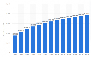
(Image Source – Statista)
- Google accounted for 94.92 percent of the mobile search market in the United States by April 2023. (Source – Statista)
- Initial mobile search results on Google reach a stunning 26.9% organic CTR. (Source – Advanced Web Ranking)
Don’t Miss:- A Step-by-Step Guide to Website Optimization Strategies for 2024
Tools & Techniques to Use for Mobile Optimization
Let’s delve into some actionable tips to ensure optimal performance on every device.
Responsive Web Design
Invest in a responsive web design that adapts to different screen sizes & resolutions. A responsive website ensures that your content looks and performs optimally across smartphones, tablets, and desktops – providing a consistent user experience regardless of the device.
Optimize Images
Images are often the heaviest webpage assets and can significantly impact loading times. Image optimization can be done by compressing them without affecting the quality. Using image formats such as WebP can help you achieve that.
Minimize HTTP Requests
Reduce HTTP requests required to load a webpage by minimizing the number of elements such as images, scripts, and stylesheets. Combine multiple CSS & JavaScript files into a single file and use CSS sprites to reduce the number of image requests.
Enable Browser Caching
Leverage browser caching to store static resources like images, CSS, and JavaScript files locally on the user’s device. This reduces server load and speeds up subsequent page loads by allowing the browser to retrieve cached resources instead of fetching them from the server again.
Minify CSS, JavaScript, & HTML
Minify CSS, JavaScript, and HTML files by removing unnecessary characters, such as whitespace & comments. Minification reduces file sizes and improves loading times by optimizing the code delivery to the browser.
Using Content Delivery Network (CDN)
Deploy a CDN to distribute your website’s static content across multiple servers worldwide. CDNs reduce latency and improve loading times by delivering content from the server closest to the user’s location – this ensures faster and more reliable access to your website’s resources.
Implement Lazy Loading
Implement lazy loading to defer the loading of non-critical resources, such as images & videos, unless required. Lazy loading prioritizes the loading of above-the-fold content, improving initial page load times while allowing additional content to load asynchronously as the user scrolls down the page.
Optimize Server Response Time
Optimize your web server’s response time by optimizing server-side code, database queries, and server configuration. Reduce server response times to ensure that web pages load quickly & efficiently to provide users with a seamless browsing experience.
Prioritize Above-the-Fold Content
Prioritize above-the-fold content loading, such as headlines, images, and CTAs- ensure users see essential information immediately upon page load. By prioritizing critical content, you can improve the quickness of your website and enhance the user experience.
Regular Performance Testing
Google PageSpeed Insights, GTmetrix, or Pingdom – are some tools that can be used for regular website monitoring. Performance testing helps identify areas for improvement and allows you to optimize your website.
Must Know:- Website Performance Metrics Monitoring & Improving User Experience
Ensuring Speed on Every Device
These unbeatable & most prominent strategies can be employed to achieve optimal website speed on every device.
Design
Implementing responsive web design ensures that your website adapts fluidly to different screen sizes & resolutions, optimizing loading times for desktop and mobile users.
Media
Optimizing images & multimedia content, minimizing HTTP requests, and enabling browser caching are effective techniques for enhancing website speed.
Tools
Leveraging tools like Google’s PageSpeed Insights and GTmetrix can provide valuable insights into your website’s performance and identify areas for improvement.
Test
Regular performance testing and ongoing optimization efforts are essential for maintaining fast loading times and ensuring a positive user experience across all devices.
Related Blog:- All You Need to Know About Website Downtime & Ways to Prevent It
Bottom Line
Mobile optimization is a must for the best user experience on every device. By implementing the tips outlined in this guide, you can optimize your website for speed and performance, improve search engine ranking, and gain a competitive edge. Remember that mobile optimization is an ongoing process, and it’s essential to regularly monitor & optimize your website to ensure optimal performance across all devices.
FAQs
Why is mobile optimization important for my website?
Mobile optimization ensures that your website loads quickly and functions smoothly on smartphones & tablets. With most internet traffic coming from mobile devices, optimizing for mobile is crucial for reaching and retaining your audience.
How can responsive web design improve mobile optimization?
Responsive web design allows your website to adapt its layout and content based on the user’s device to ensure a consistent & user-friendly experience across all screen sizes. By implementing responsive design principles, you can optimize your website for mobile users and improve its speed and performance.
What role do images play in mobile optimization?
Images are essential for web design but can significantly impact page load times, especially on mobile devices. Optimizing images by compressing them without sacrificing quality can help improve loading speeds.
How to test website mobile optimization?
Google’s Mobile-Friendly Test tool allows you to assess your website’s mobile compatibility and provides recommendations for improvement. Additionally, tools like GTmetrix and Pingdom offer performance testing features that can help identify areas for optimization and enhancement.
What are some common mobile optimization pitfalls to avoid?
Common pitfalls to avoid include:
- using large or unoptimized images
- neglecting to implement responsive design principles, &
- overlooking the importance of minimizing HTTP requests.
By addressing these issues, you can ensure a smoother and faster mobile browsing experience for your users.
What impact does mobile optimization have on search engine rankings?
Search engines like Google prioritize mobile-friendly websites in their search results, meaning mobile optimization can impact a website’s visibility & ranking significantly. By ensuring your site is optimized for mobile devices, you can improve its search engine performance and attract more organic traffic.
What are other ways to do website mobile optimization?
You can hire web maintenance agencies like Provis Technologies for your site’s mobile optimization. They can also help you elevate your business via your website.
Written By
Author's Picks
- Website Performance Metrics Monitoring & Improving User Experience
- 14/12/2023
- Future Proofing with PHP – Why is Regular Maintenance Essential?
- 26/12/2023
- A Step-by-Step Guide to Website Optimization Strategies for 2024
- 04/01/2024
Categories
- AI for Startups
- AI in Web Development
- AI Integration
- AI Platforms
- AI Prompt
- AI Tools
- AI Trading Software
- Android App
- Android vs iOS Development
- Angular
- API
- API Development
- App
- app development
- App Idea
- App User Feedback
- Application
- Artificial Intelligence
- Audit Services
- Automotive Industry
- Awards and Recognition
- Business Consulting
- Business Website
- Chatbots
- CRM
- CRM for Financial Advisors
- Custom CRM
- Custom SaaS
- Custom Website
- Customer Service
- dashboard design
- Developing a Mobile App
- Digital Business
- E-commerce
- EMR Integration
- Finance
- Financial Advisors
- Financial Advisors
- GIT
- Health Insurance
- iOS App
- iOS App Development
- IoT Mobile App Development
- IoT Platforms
- IT Audit Services
- IT Consulting
- IT Strategies
- Java Development
- Laravel
- Lean Canvas
- Learning Management System
- Logistics Apps
- Mobile App Development
- MVP
- Native App
- News Aggregator Site
- OTT
- Outsourcing IT
- Payment Gateway
- predictive analysis
- Product Launch Strategy
- Progressive Web App (PWA)
- Prototype
- Recommender Systems
- Ruby
- SaaS
- SaaS Application
- SaaS Business
- SaaS Company
- SaaS Development
- SaaS Product
- SaaS Project
- Sales Funnel
- SEO
- Shopping Cart
- Software Development
- SSL and TLS
- Startup Checklist
- Technology
- Tetradic Color Scheme
- UI/UX Design Company
- Unit Testing
- User Flow
- User Testing
- Web Development
- Web Performance Optimization
- website Maintenance Services
- Website Migration Service
- Website Speed Optimization
- WooCommerce
- WordPress