


 FREE AI performance audit


Written By
Author's Picks
- How to Create an App Using AI/ML for Your Business
- 25/08/2024
- Top 8 Programming Languages for Mobile App Development
- 30/08/2024
- How to Choose a Mobile App Development Framework: A Beginner’s Guide
- 26/08/2024
Categories
- AI for Startups
- AI in Web Development
- AI Integration
- AI Platforms
- AI Prompt
- AI Tools
- AI Trading Software
- Android App
- Android vs iOS Development
- Angular
- API
- API Development
- App
- app development
- App Idea
- App User Feedback
- Application
- Artificial Intelligence
- Audit Services
- Automotive Industry
- Awards and Recognition
- Business Consulting
- Business Website
- Chatbots
- CRM
- CRM for Financial Advisors
- Custom CRM
- Custom SaaS
- Custom Website
- Customer Service
- dashboard design
- Developing a Mobile App
- Digital Business
- E-commerce
- EMR Integration
- Finance
- Financial Advisors
- Financial Advisors
- GIT
- Health Insurance
- iOS App
- iOS App Development
- IoT Mobile App Development
- IoT Platforms
- IT Audit Services
- IT Consulting
- IT Strategies
- Java Development
- Laravel
- Lean Canvas
- Learning Management System
- Logistics Apps
- Mobile App Development
- MVP
- Native App
- News Aggregator Site
- OTT
- Outsourcing IT
- Payment Gateway
- predictive analysis
- Product Launch Strategy
- Progressive Web App (PWA)
- Prototype
- Recommender Systems
- Ruby
- SaaS
- SaaS Application
- SaaS Business
- SaaS Company
- SaaS Development
- SaaS Product
- SaaS Project
- Sales Funnel
- SEO
- Shopping Cart
- Software Development
- SSL and TLS
- Startup Checklist
- Technology
- Tetradic Color Scheme
- UI/UX Design Company
- Unit Testing
- User Flow
- User Testing
- Web Development
- Web Performance Optimization
- website Maintenance Services
- Website Migration Service
- Website Speed Optimization
- WooCommerce
- WordPress
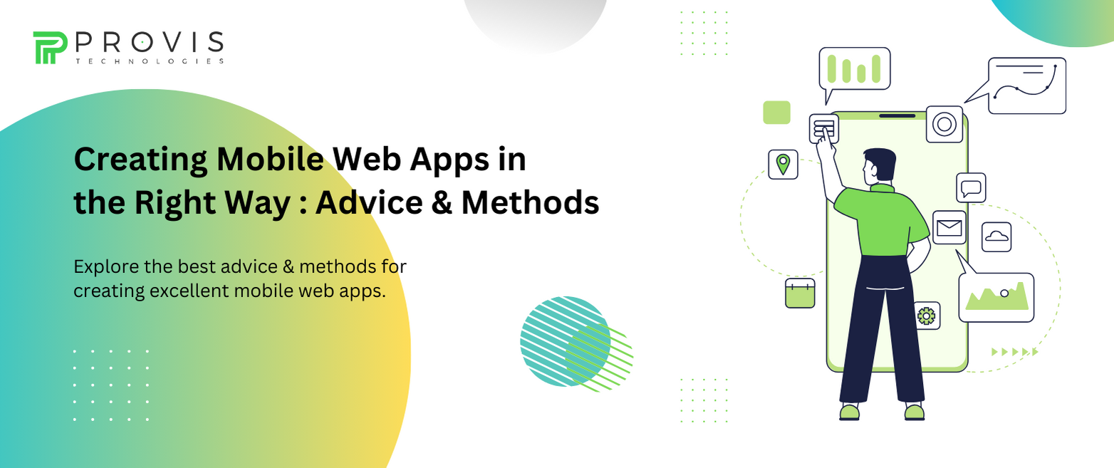
Mobile web apps have become a vital part of our daily lives. From ordering food & weather checking to social networking & online shopping – these apps serve a horde of purposes. However, creating a mobile web app that stands out in the crowded digital landscape isn’t that easy. It requires thorough planning, careful design choices, and a commitment to delivering an exceptional user experience.
Today, we will explore the best advice & methods for creating excellent mobile web apps.
Steps to Build Successful Mobile Applications
Setting Goals
Before deep diving into development, it’s goals that need to be set first. Knowing them and who you’re building the app for will guide every aspect of its creation. Understanding your app’s niche will help you make informed decisions throughout development.
Righteous Approach
There are several ways to create mobile web apps – your choice of approach can significantly impact the final product. There are three kinds of mobile apps you can make:
- Responsive Web Design
Responsive web design involves creating a single web app that adapts its layout and functionality based on the user’s device. This approach is excellent for content-focused apps and blogs. It ensures your app looks and works well across various devices & screen sizes.
- Progressive Web Apps (PWAs)
PWAs are a powerful blend of web & native app features. They provide offline access, push notifications, and fast load times, all while running in a web browser. Progressive web apps are perfect for delivering an app-like experience without them being downloaded or installed. They are particularly suitable for e-commerce & news apps.
- Hybrid Mobile Apps
Hybrid apps are built using web technologies such as HTML, CSS, & JavaScript – and placed in a native app shell. Popular frameworks like React Native and Ionic facilitate the development of hybrid mobile apps. Choose the app that can turn your goals into reality.
Also Read: How to Create an App Using AI/ML for Your Business
Prioritize Performance
Performance is paramount in the world of mobile web apps. Users expect apps to load faster and respond quickly to their interactions. The following should be done for the best results:
- Optimize Images & Media
Large images & unoptimized media files can slow down your app. Use image compression tools and serve appropriately sized pictures to minimize loading times.
- Minimize HTTP Requests
Each HTTP request adds latency to your app’s loading time. Minimize the number of requests by bundling & minifying CSS & JavaScript files.
- Implement Lazy Loading
Lazy loading loads content as users scroll down the page – reducing initial load times. Prioritize the upper side content visible without scrolling – and load the rest progressively.
- Utilize Content Delivery Networks (CDNs)
CDNs distribute your app’s static assets (images, scripts, or styles) to servers worldwide. This ensures that users from different geographic locations experience fast load times.
Related Blog: Android vs iOS Which is the Best Platform for App Development?
Responsive Design
With the wide variety of devices & screen sizes today, responsive design is a must. Implement responsive layouts & fluid grids to ensure your app looks and functions well – from small smartphone screens to large tablet displays.
User-Friendly Navigation
Instinctive navigation is the backbone of any successful mobile web app. Users should be able to navigate your app effortlessly – finding what they need with minimal effort. You can consider the following navigation principles:
- Clear Menus & Labels
Use clear & concise menu labels & navigation buttons. Ensure users can easily access essential features.
- Right Placement
Maintain a consistent placement of navigation elements across different sections of your app. Users should not have to relearn the navigation as they move through your app.
- Gesture Controls
Leverage gestures like swiping & pinching for tasks that benefit from tactile interaction. Ensure that these gestures are intuitive & well-documented.
Don’t Miss: A Complete Checklist to Build a Secure Mobile App
Mobile-First Designing
Start designing your app with mobile devices in mind. This approach ensures the app’s core functionality & user experience are optimized for smaller screens. Here are some mobile-first design principles:
- Simplify Content
Keep content concise & prioritize the most essential information. Mobile screens have limited space – make every pixel count.
- Touch-Friendly Elements
Design touch-friendly buttons & interactive elements that are easy to tap and interact with on touch screens.
- Progressive Enhancement
Begin with essential functionality that works well on all devices and progressively enhance the experience for users with larger screens and more advanced capabilities.
- Performance Optimization
Speed is a crucial factor in user satisfaction. Slow apps can lead to high bounce rates & frustrated users. Some strategies for optimizing speed include:
- Browser Caching
Leverage browser caching to store static assets on users’ devices – reducing the need to fetch resources with each visit.
- Content Delivery Networks
Use CDNs to distribute your app’s assets to servers closer to the user – reducing latency and load times.
- Code Splitting
Implement code splitting to load only the necessary JavaScript or CSS for a page or view – reducing the initial load time.
Cross-Browser Compatibility
Testing your mobile web app on multiple browsers & devices is crucial. Browser dev tools & online testing services can be used to find out & fix glitches. Implement feature detection rather than browser detection to ensure your app works across various platforms.
Must Know: Top 10 Tips to Reduce App Development Costs
Emphasize Accessibility
Ensure that your mobile web app is accessible to users with disabilities. Follow WCAG (Web Content Accessibility Guidelines) to create an inclusive user experience.
Key accessibility considerations include:
- Semantic HTML
Use semantic HTML elements to provide structure and context to your content. Screen readers rely on these elements to convey information to users.
- Alt Text for Images
Include descriptive alt text for images to inform users who cannot see them.
- Keyboard Navigation
Ensure that all interactive elements can be accessed and used via keyboard navigation, as some users may rely on it instead of a mouse or touch input.
- Regular Testing
Thorough testing is essential to identify and fix bugs and issues in your mobile web app. Conduct manual testing on real devices, employ automated testing tools, and conduct performance testing to analyze load times & identify bottlenecks. Additionally, gather user feedback through surveys, analytics, and user testing. Use this feedback to iterate and improve your app continually.
Security First
Security should be a top priority throughout your app’s development lifecycle. Protect user data and ensure your app is not vulnerable to common web attacks. Implement security best practices, such as:
- HTTPS
- Encryption
- Cookie Expiration date
- Content Security Policy
Conclusion
Correctly creating a mobile web app involves a combination of purpose, design, performance optimization, user-centric navigation, and accessibility. Following the above advice & methods, you can ensure that your mobile web app delivers a stellar user experience. You can also hire a mobile web app developer company like Provis Technologies to build a mobile web app for you.
Written By
Author's Picks
- How Progressive Web Apps (PWAs) Are Transforming the E-commerce Landscape?
- 11/09/2024
- Fixed vs. Hourly Pricing Models: Choosing the Right Strategy for Your App Development Cost
- 28/08/2024
- Android vs iOS Which is the Best Platform for App Development?
- 05/07/2024
Categories
- AI for Startups
- AI in Web Development
- AI Integration
- AI Platforms
- AI Prompt
- AI Tools
- AI Trading Software
- Android App
- Android vs iOS Development
- Angular
- API
- API Development
- App
- app development
- App Idea
- App User Feedback
- Application
- Artificial Intelligence
- Audit Services
- Automotive Industry
- Awards and Recognition
- Business Consulting
- Business Website
- Chatbots
- CRM
- CRM for Financial Advisors
- Custom CRM
- Custom SaaS
- Custom Website
- Customer Service
- dashboard design
- Developing a Mobile App
- Digital Business
- E-commerce
- EMR Integration
- Finance
- Financial Advisors
- Financial Advisors
- GIT
- Health Insurance
- iOS App
- iOS App Development
- IoT Mobile App Development
- IoT Platforms
- IT Audit Services
- IT Consulting
- IT Strategies
- Java Development
- Laravel
- Lean Canvas
- Learning Management System
- Logistics Apps
- Mobile App Development
- MVP
- Native App
- News Aggregator Site
- OTT
- Outsourcing IT
- Payment Gateway
- predictive analysis
- Product Launch Strategy
- Progressive Web App (PWA)
- Prototype
- Recommender Systems
- Ruby
- SaaS
- SaaS Application
- SaaS Business
- SaaS Company
- SaaS Development
- SaaS Product
- SaaS Project
- Sales Funnel
- SEO
- Shopping Cart
- Software Development
- SSL and TLS
- Startup Checklist
- Technology
- Tetradic Color Scheme
- UI/UX Design Company
- Unit Testing
- User Flow
- User Testing
- Web Development
- Web Performance Optimization
- website Maintenance Services
- Website Migration Service
- Website Speed Optimization
- WooCommerce
- WordPress